Chase, Cash Back Native Uplift | UX/UI

The uplifted native Cash Back experience.
Role: Content Design
Team: Loyalty — Rewards
Timeline: June 2024
Tools: Figma, JIRA, Confluence
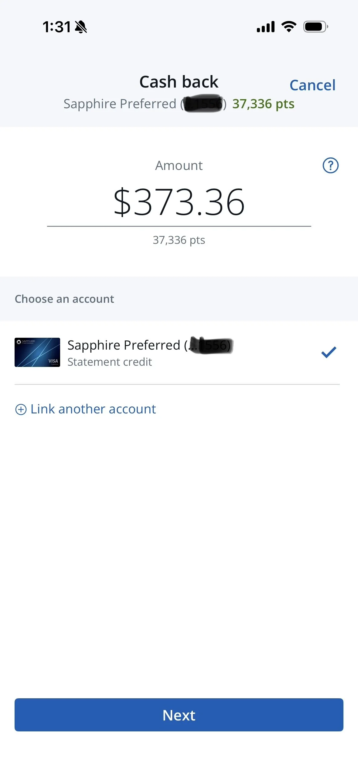
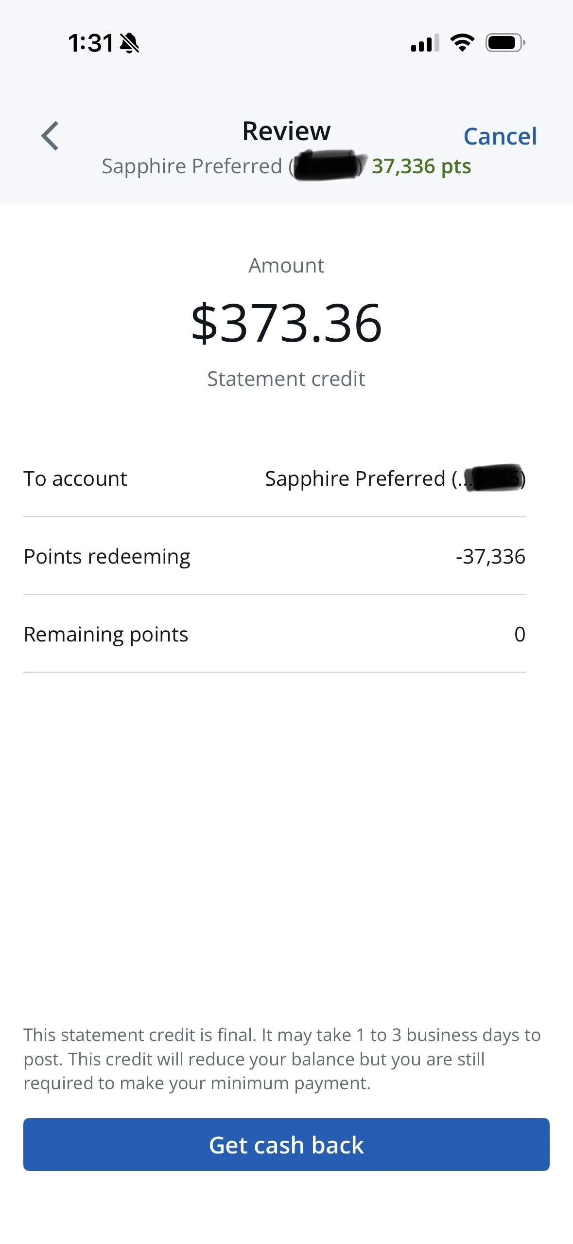
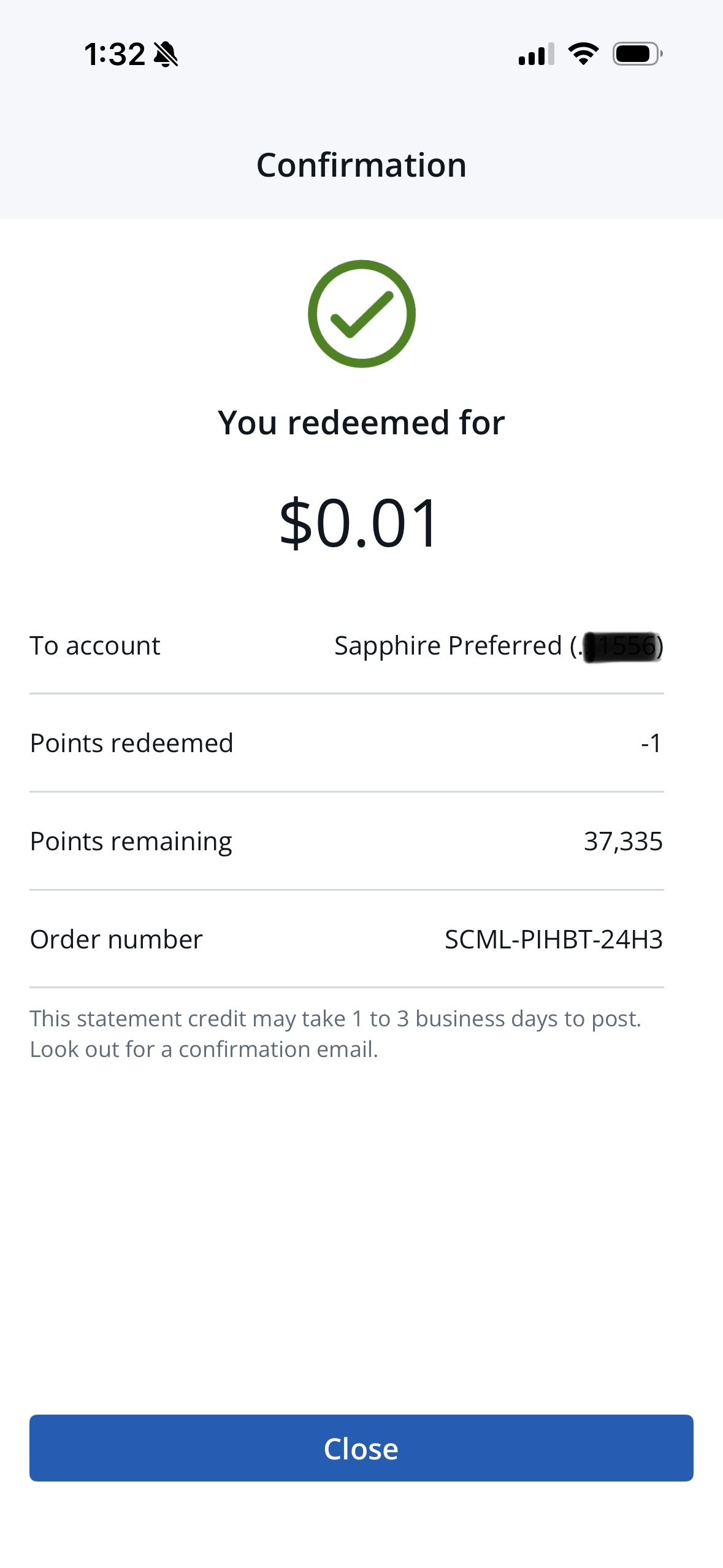
Cash back is one of the top redemption options across all Chase cards, especially for Freedom customers. As part of a larger initiative to translate the Rewards experience to mobile native, we reduced the legacy Cash Back experience down to a simple, three screen flow. We pared back clicks, copy, and cognitive load to make the redemption less of an exercise in decision making — How many points am I redeeming? Where will this cash go? — to a quick and easy way for users to get some cash in their wallets.
By making the cash-to-points calculator automatic rather than manual, users can make real-time updates to how many points they want to convert. Deciding which account you want to make your deposit into has been pre-selected rather than something for the user to have think about every time. And removing extraneous on-screen content allows savvy users to get their cash and go, reducing cognitive load and increasing completion rates
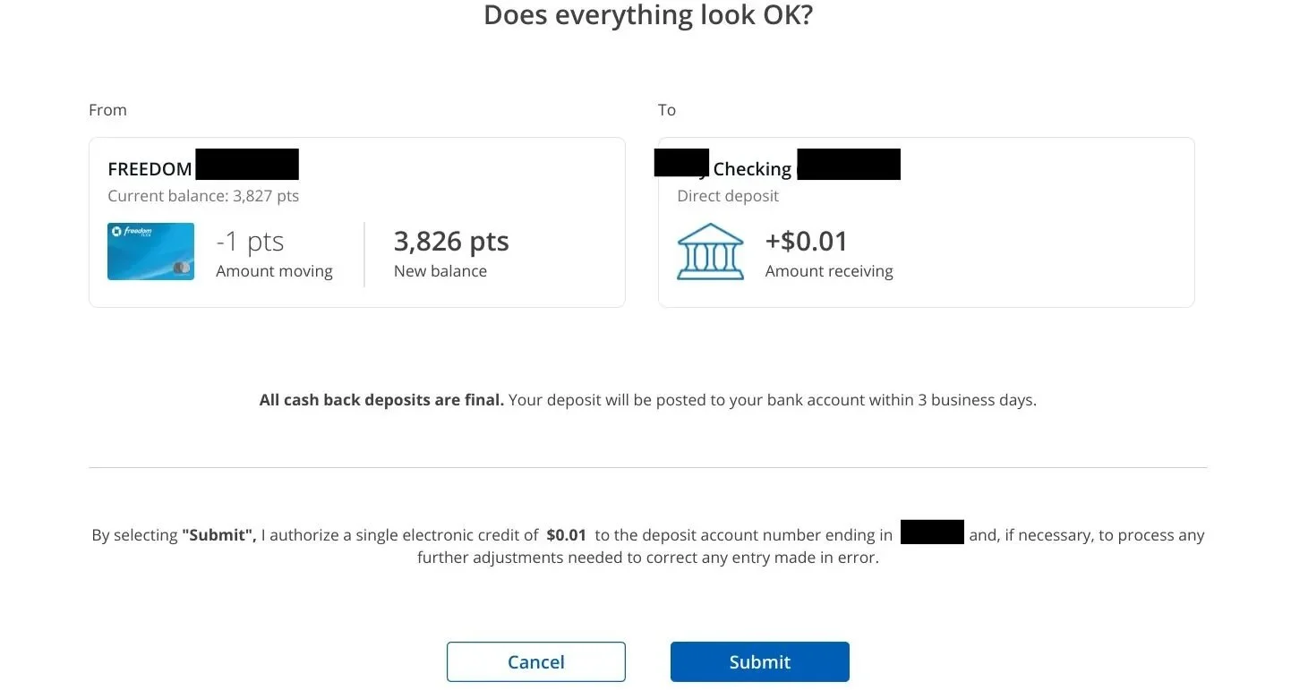
The legacy (web) experience shows the pre-uplift design system, page hierarchy on the Cash Back confirmation page. There has been a design org-wide effort to reduce the amount of content on-screen, and this uplift was the perfect opportunity to strip back to only what was strictly necessary for users to move forward with the experience.
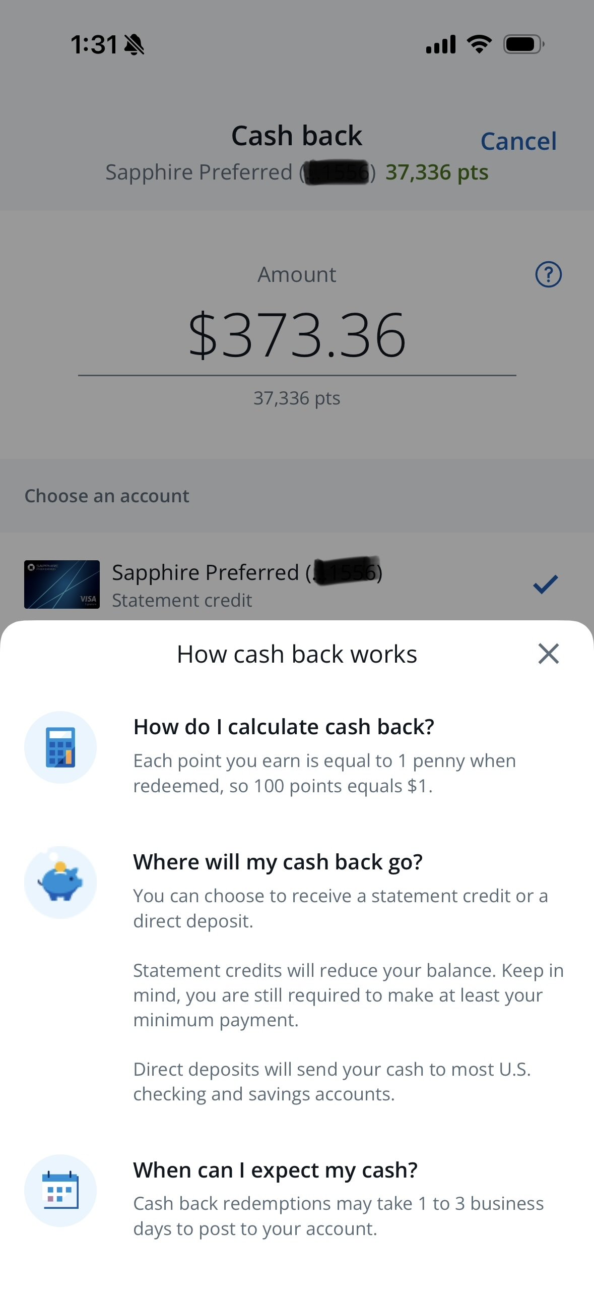
Zoom in: We decided to move the “How it works” content to a bottom sheet activated by tooltip in order to reduce the amount of on-page copy.